|
Until late 2007, hashtags were just one of the buttons you never used on your phone. Then people started to use them to categorize social media posts, and a new way of reaching your target audience was born.
Social media is completely saturated with influencers and people vying for attention. It can be hard to stand out! That’s where hashtags come into play. Hashtags help people organize how they browse through social media apps and indicate to viewers what kind of post they’re looking at.
So, what makes for a great hashtag? Here are some tips that can help you reach your audience and hopefully up for interaction and followers . . . if the dreaded algorithm doesn’t play against you. Keep it simple
Pick hashtags that are short and straightforward. If you’re a Tumblr user, you might be familiar with their rambling hashtags that one should read as part of the post (like #justkidding #whywouldtheywriteitlikethis #helpimtrappedinmybroomcloset, etc.). Other social platforms like Twitter and Instagram do not use hashtags like this. Instead, you’ll want to keep the hashtags simple.
Keep it relevant
Your hashtags should be true to the post you are making. For example, don’t use #PrideMonth just because you’re making a post in June, which is Pride Month. That post will need to be related to queer culture or a Pride Month event for that hashtag to be relevant.
Do your research
Look up hashtags before you use them. If the hashtag has been used a lot, your post may get lost in the mix of everyone else who is using it. An example of an overused hashtag is #outfitoftheday, often abbreviated as #ootd. Fashion influencers may still use this hashtag, but they don’t expect a huge impact from this hashtag alone.
Use trending hashtags
A hashtag’s popularity will come and go. But how do you know which ones are currently hot? Thankfully, there are sites out there that will do the work for you, like hashtags.org or best-hashtags.com. At hashtags.org, you can enter a hashtag and see how it has been trending. At best-hashtags.com, you can look up a hashtag’s popularity, and you can even cut and paste hashtags from that site into your post. Just remember to edit and add to this list and use only the ones that are relevant to you.
Limit your hashtags
Instagram allows you to use up to 30 hashtags per post. If you exceed 30 hashtags, Instagram will post your photo without any text or hashtags. You’ll have to retype your whole caption, which sucks! (Trust us, we’ve been there.) On Twitter, you only want to use one or two hashtags that can be worked organically into the post, so make sure they are relevant. On TikTok, you’ll want to use only 4-5 hashtags.
We’ll go into deep dives later about how to use hashtags uniquely on each of these platforms, but this is a great starting point! With these tips you will be on the right path to reaching your target audience. So, get out there and engage, and before you know it, you will be reaching your audience, and your following will grow!
0 Comments
You’ve likely heard about the divisiveness of the font Comic Sans. The font is not inherently bad; in fact, it’s friendly and inviting. However, the font is widely regarded as a joke, and yet it remains available to users of many word processors more than 25 years after its invention. How did Comic Sans come to be? How did it turn into such a joke? And why is it still available for anyone to use?
The invention of Comic Sans
Let’s go back in time a bit to the early days of the internet. In the mid-1990s, Microsoft was only just starting to place personal computers in people’s homes. These days, a three-year-old can pick up any smart phone and perform a number of tasks. Back in the 90s, most professionals did not know how to use a computer.
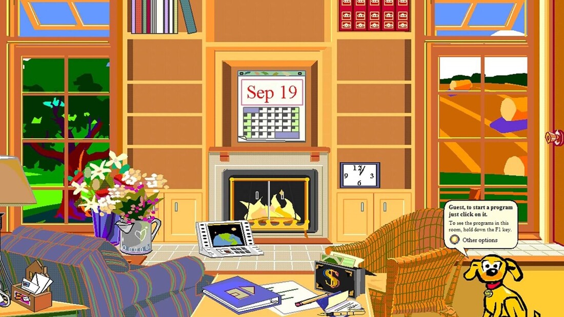
To teach private users how to interact with a computer interface, Microsoft developed Microsoft Bob. Microsoft Bob was a program that visually resembled a standard upper-middle-class home office. The idea was that connecting computer functions to the image of an office would help people to conceptualize what their computer was capable of. Characters in Microsoft Bob communicated with the user through speech bubbles, and that speech was originally set in Times New Roman.
The problem was that Microsoft Bob . . . sucked. It was clunky and unhelpful. Even Melinda Gates has referred to it as a failure.
What does this have to do with Comic Sans? Comic Sans was developed by Vincent Connare specifically for use in Microsoft Bob. He felt that Times New Roman was too stiff and formal for what was supposed to be a learning program. It was meant to emulate chunky, childish comic book fonts, and its purpose was to set first-time computer users at ease. The problem was that Comic Sans was not complete before the first iteration of Microsoft Bob rolled out, Microsoft Bob was a failure that did not last long, and Comic Sans probably should have been thrown directly in the garbage at this point. But it wasn’t. Beyond Microsoft Bob
Connare said in an interview with Ilene Strizver of fonts.com, “When I designed Comic Sans, there was no expectation of including the font in applications other than those intended for children.” Microsoft first used Comic Sans in text bubbles in Microsoft 3D Movie Maker, which was indeed designed for children. Eventually, however, Comic Sans was added to the 1995 Windows as a system font option.
Soon, graphic designers and computer users alike quickly grew tired of seeing Comic Sans everywhere, particularly in serious correspondence, where the silly font was inappropriate. In 1999, two graphic designers launched a website called Ban Comic Sans in response to being pressed to use Comic Sans for a museum exhibit design. As the internet was popularized and meme culture grew, the joke of Comic Sans grew with it. One of the most popular Comic Sans memes is the original doge meme, a series of images of grinning Husky dogs captioned with silly messages written using questionable grammar and spelling—and using Comic Sans. In 2011, Microsoft released Comic Sans Pro, which included features like italics, small caps, and more. This was released on April Fools’ Day, furthering the narrative that Comic Sans is a joke. What are fonts for?
Fonts carry vibes; there’s no getting around that. Even the most common, neutral fonts, like Times New Roman or Arial, say that the writer is straightforward, professional, and/or no-nonsense. Using audacious fonts like Chiller or Blackadder for anything real, anything substantial, says the writer is immature and not taking their project seriously. That’s the reality of fonts.
Microsoft Word can carry hundreds of different fonts, but most of the time, a regular user simply doesn’t need these. The many thousands of fonts that exist on the internet are for graphic designers to choose with much discerning. Regular people may not know what fonts look ridiculous in what circumstances, but a designer is trained to use different fonts to carefully curate a book’s (or graphic’s) aesthetic. The problem with Comic Sans is not that it exists. Wingdingz exists for some reason, so there are more baffling fonts out there. The problem with the font is that it seems like many people have no idea what kind of impression it sends, and they use it so liberally. The average internet user will see Comic Sans so much more frequently than Chiller or Blackadder. The font is specifically designed to be animated, juvenile, and silly. It kind of replicates a child’s handwriting, if they were particularly uniform and neat. Yet there are many people out there who use Comic Sans in baffling situations, like when sending an office memo or creating a resume. Comic Sans is sort of the polar opposite of professionalism, representing immaturity, movement, and failure. When scientists at CERN discovered the Higgs Boson, Fabiola Gianotti presented her results using Comic Sans. A Dutch World War II memorial was unveiled in 2012 featuring the names of Jewish, Allied, and German military deaths, all written in Comic Sans. During the UK’s great Brexit debate, the conservative party tweeted a message encouraging the parties to come together, which had been styled in Comic Sans. These are some great examples of times in which Comic Sans should not have even been considered for one moment, as its use greatly diminished the weight of what was being said. Why this is important for authors
Especially for authors who are just getting their writing careers started, nothing is more important than being professional. Publishers, editors, and even readers want to be assured that you know what you’re doing, that you’re professional, that you take your work seriously.
Particularly because typography is such an integral part of publishing a book, it’s even more important for an author to demonstrate that they have an understanding of parts of a book, including typefaces. The use of Comic Sans says, “Don’t take me seriously, and my book won’t be serious either.” What's Comic Sans good for, then?
Comic Sans is good for casual communication that is not serious, not professional, and not important. If you’re in a situation where font just straight-up does not matter, fine. Use Comic Sans. But be aware that you may be judged for it nonetheless.
There is also anecdotal evidence that Comic Sans is easier than other fonts for dyslexic people to read, though there have been no studies to support this with concrete data. However, it’s common for readers with dyslexia to prefer sans serif fonts, and the weighted sides of Comic Sans may indeed make text easier to read. There is also anecdotal evidence that Comic Sans helps writers to get rid of writer’s block, as the casual and even silly appearance of the font takes some pressure off that a writer may be feeling when writing in Times New Roman, the preferred font of publishers. This is not to say that Comic Sans is good for nothing. We are just here to beg people to stop using the font seriously, professionally, and opt for sharper options. If you’re not keen on the standard Times New Roman or Arial, try a similar variant like Garamond or Calibri. We’re happy to advise!
Sources:
https://uxdesign.cc/the-ugly-history-of-comic-sans-bd5d07f8ce81 https://www.fonts.com/content/learning/fyti/typefaces/story-of-comic-sans https://www.howtogeek.com/707340/the-origin-of-comic-sans-why-do-so-many-people-hate-it/ written by Christina Kann The surprisingly useful writing advice (that doesn’t actually require alcohol)
There is a lot of writing advice out there.
Write every day at 3 a.m.! Write on an old typewriter! Subscribe to this writing class for only $99.95! Write at least two thousand words a day! (Calm down, Stephen King.) Buy this expensive notebook for inspiration and then never write in it because it’s too much pressure! (That one’s from me.) While it’s hard to figure out what’s useful and what’s useless in the world of writing guidance, there is a bit of advice that connects many of the most successful writers in the world: Write drunk, edit sober.
Yep! This succinct bit of advice (credited to the perpetually-drunk Ernest Hemingway) packs a surprisingly strong double-shot of usefulness, and you don’t actually have to drink a damn thing to use it.
Here, I’ll translate: Write without inhibitions; edit full of them. When it comes to writing your first draft, just write it. Spit it out. Don’t censor yourself. That voice inside your head that stops you every time you start to put pen to paper (or fingers to keys)—the one that tells you your ideas aren’t good enough, the words aren’t right, a “real writer” would know what to do with all your jumbled ideas—tell that fool to shut up! There is no “real writer,” and there is no perfect first draft. You can’t turn your ideas into a well-crafted book while they’re still floating around in your head. As V.E. Schwab (author of many wildly successful books Wildling can personally recommend, like Vicious and The Invisible Life of Addie LaRue) has said, “You can’t write a book right until you write it wrong.” This means you don’t write a great book--you just write, then you make the book great through editing. Even Neil Gaiman, one of the most prolific, successful, and imaginative writers of our time, has repeatedly told his fans, “The process of doing your second draft is the process of making it look like you knew what you were doing all along.” It’s only after you’ve spilled all your ideas onto paper that you begin the tough, slow, sometimes sobering work of editing. Most of your favorite authors, from those we study in school to cult favorites and guilty pleasures, are great at pouring out the first draft with some version of wild abandon, and then editing that mess meticulously--sorting, organizing, rearranging, cutting, and reworking it until it’s the carefully crafted finished piece their readers fawn over. Great writing may read like magic, but it actually took a lot of regular, sometimes painful, sometimes boring, sometimes bad (and yes, sometimes drunk) human work to make it. So whether you need a swig of good whiskey to help you loosen up or not, just remember: write like there are no rules--save those for the second draft. Stretch your fingers, shake those doubts from your mind, and write with the untethered audacity of a drunk Ernest Hemingway. You won’t regret it. by Mary-Peyton Crook
Some people say that when you read a book, you create a movie in your head, so there’s simply no need for the existence of book-to-film adaptations. However true that may be, those adaptations do exist, and some are excellent and others are absolute travesties. Here at Wildling, we have strong opinions on this topic, and we’re sharing them with you!
Christina's fave: His Dark Materials (2019-current)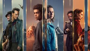
This is a TV show on Amazon, not a film, but same diff! This series based on the Philip Pullman trilogy is a beautiful, skillful tribute to the original text. The book series is complex, fantastical, and multifaceted, and the show manages to convey all of the many layers of this story without seeming to have to compress anything together or skip anything—seriously, I was hard-pressed to find a single omission that I didn’t fully agree with. In fact, they even found the time to develop some characters and plotlines more thoroughly than the books did. This show is the perfect argument for my thesis that fantasy book series are truly better served by being developed into shows rather than films. Seasons 1 and 2 (based on books 1 and 2) are out on Amazon now, with Season 3 due in 2022.
Christina's failure: Dune (1984)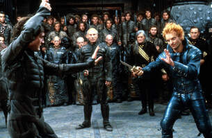
This film is an insult to the original text, its beautiful and cerebral themes, and its vast, fiercely devoted fan base. The film was too long by about two hours, and yet somehow it failed to explain properly even the most foundational concepts from the novel. Granted, the novel is dense, vast, and epic—but the movie seemed to have truly turned its nose up at the source material the way a child quits the school band when they can’t master the trumpet within a week. The ubiquitous touch of the mid-eighties didn’t help things, either. DO NOT WATCH.
The new movie is great, though. Christina's bonus: Ella Enchanted (2004)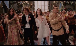
There are a couple of films out there that are terrible adaptations of their source material, but really fun in their own right. My numero uno in this category is Ella Enchanted. The book is great. The film is great. They have next to no resemblance to each other beyond some core concepts, like the main character having to obey any command and eventually falling in love (sorry, spoilers!). My brain can separate these enough to appreciate each of them without comparing them.
Mary-Peyton's fave: Anne of Green Gables (1985)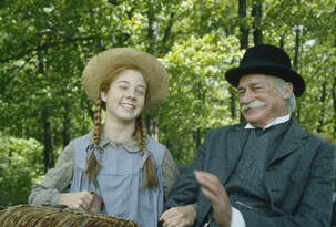
I could watch the 1985 film adaptation of this book over and over again! It really captured the heart of the book, and Megan Follows perfectly captured the wild spirit of Anne Shirley--a kind, clumsy, and stubborn girl adopted by an older couple who had wanted to adopt a boy, but ended up falling in love with the quirky redheaded bookworm. I wish every little girl could watch this movie, like I did (well, maybe not exactly like I did, since I had it on two VHS tapes). Anne didn’t fit into the small, quiet box that young ladies were meant to inhabit in her world (and still are in this world), and although people tried to shame her, she never apologized for being herself. The acting in this film was perfect, subtle, and real, and the writing kept much of the humor and heart that makes the book so wonderful. I highly recommend this for a family movie night.
Mary-Peyton's failure: The Lion, the Witch, and the Wardrobe (2005)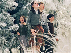
When I read these books as a kid, I was enchanted. The real world would melt away, and I’d find myself completely within the world of Narnia alongside Lucy, Edmund, Susan, Peter, and Aslan. So years later, when I first saw the movie trailer, I was beyond excited. But I was so disappointed in the movie. As often happens when grown-ups decide to make a popular children’s book into a movie, it had lost much of what made the story wonderful; ironically, it had lost much of its wisdom and depth. The best kids books, the classics that stay with us throughout time, deal with some really heavy and “grown-up” topics, like grief, betrayal, and loneliness, in such a way that helps kids process those things. But the movie version of such books often comes out as a shallow, cartoonish, and flashy shell of the book. Ella Enchanted, The Golden Compass, and the Percy Jackson series are great examples of this--those books are downright dark and even scary at parts, which makes the story so much more intense; the more terrible the evil, the more magical it is when good wins. Kids don’t fall in love with these magical adventures because they’re fun; they love them because they are full, deep, and emotional stories of bravery, growth, kindness, and more. The fantastical adventure is only part of the appeal. It seems like the people who made these movies missed the point.
Michael's fave: The Princess Bride (1987)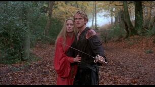
Who doesn’t love The Princess Bride film adaptation? If you don’t, I don’t want to know you. Too harsh? Maybe, but this movie is amazing! It has it all: adventure, comedy, suspense, and wuv, tru wuv. William Goldman, the author, was a huge part of the adaptation and this helped keep the movie true to the book. And with Rob Reiner directing, pure magic was made. He also directed book to movie adaptations like Stand by Me and Misery. The only bits and pieces of the book that are not found in the film were edited out simply because of time constraints. And anything added were small additions; did you know there weren’t any shrieking eels in the book? As someone who deliberately reads the book before the movie comes out so they can tell whoever will listen how much the movie failed to capture the power of the book, I’m happy to report that this is one adaptation I can do nothing but praise.
Michael's failure: Miss Peregrine's Home for Peculiar Children (2016)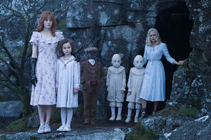
I had such high hopes for this film adaptation, especially with Tim Burton at the helm! I just knew he would be able to capture the right amount of darkness that hangs over the Peregrine universe. But . . . the movie was an utter disappointment. The author, Ransom Riggs, should have had more of an opinion during filming. Tim Burton ended up swapping the main female character’s powers for those of a weaker female character, which felt like it was just so the main male character could be more of a hero. Then, because Tim Burton wanted to work with Samuel L. Jackson so badly, he created a character and story line that isn’t found in the book. It completely changed the vibe of the first book, and the direct consequence was they couldn’t make a movie series using the other books. Maybe that was a blessing because this film was a complete letdown.
Grace's fave: Practical Magic (1998)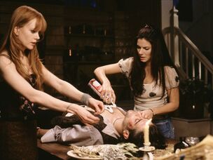
I probably watched this movie for the first time during my preteen years, so it has a special place in my heart. When I found out it was based on a book by none other than the amazing Alice Hoffman, I had to read it. Even though I really enjoyed this book, I truly think the movie is a culmination of the book’s strongest parts—and that’s not just because of the “special place in my heart” thing I mentioned. Okay, maybe a little. There are plenty of differences between the book and movie versions, and they’re both fabulous in their own ways, but I think the Practical Magic movie is an awesome example of how a film adaptation doesn’t have to be a scene-for-scene remake of the book to be good.
Grace's failure: Percy Jackson and the Olympians: The Lightning Thief (2010)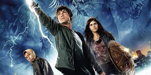
This movie adaptation is so bad that I haven’t even seen it!! I’ve heard enough to know I need to stay away, far away. I know, I probably should’ve included a movie adaptation I’ve actually seen, but the validity of our list would’ve been called into question without, so did I really have a choice? I somehow missed the Percy Jackson train when it rolled through years ago, so I’m catching up and reading them now. I’m smack-dab in the middle—ugh, maybe I’ll end up watching the movie one day. I’ll let you know if I do!
Feel free to add to our list with your favorite and least favorite book-to-film adaptations in the comments below! by Grace Ball |
How Do I Book?We'll try to find the answer to that question in our blog. Archives
August 2023
Categories
All
|

 RSS Feed