|
You’ve likely heard about the divisiveness of the font Comic Sans. The font is not inherently bad; in fact, it’s friendly and inviting. However, the font is widely regarded as a joke, and yet it remains available to users of many word processors more than 25 years after its invention. How did Comic Sans come to be? How did it turn into such a joke? And why is it still available for anyone to use?
The invention of Comic Sans
Let’s go back in time a bit to the early days of the internet. In the mid-1990s, Microsoft was only just starting to place personal computers in people’s homes. These days, a three-year-old can pick up any smart phone and perform a number of tasks. Back in the 90s, most professionals did not know how to use a computer.
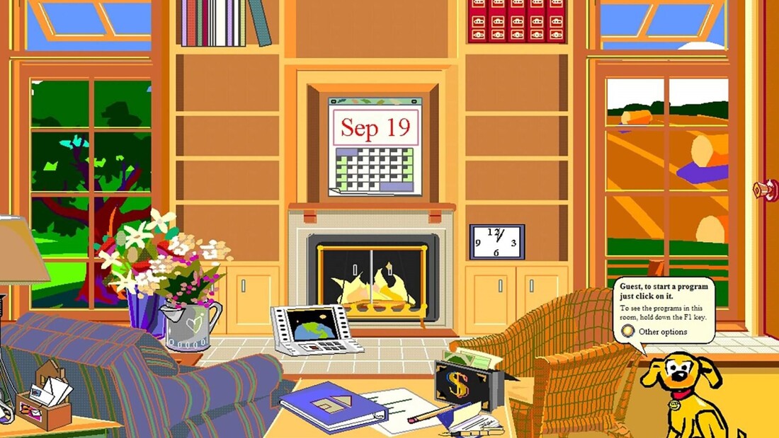
To teach private users how to interact with a computer interface, Microsoft developed Microsoft Bob. Microsoft Bob was a program that visually resembled a standard upper-middle-class home office. The idea was that connecting computer functions to the image of an office would help people to conceptualize what their computer was capable of. Characters in Microsoft Bob communicated with the user through speech bubbles, and that speech was originally set in Times New Roman.
The problem was that Microsoft Bob . . . sucked. It was clunky and unhelpful. Even Melinda Gates has referred to it as a failure.
What does this have to do with Comic Sans? Comic Sans was developed by Vincent Connare specifically for use in Microsoft Bob. He felt that Times New Roman was too stiff and formal for what was supposed to be a learning program. It was meant to emulate chunky, childish comic book fonts, and its purpose was to set first-time computer users at ease. The problem was that Comic Sans was not complete before the first iteration of Microsoft Bob rolled out, Microsoft Bob was a failure that did not last long, and Comic Sans probably should have been thrown directly in the garbage at this point. But it wasn’t. Beyond Microsoft Bob
Connare said in an interview with Ilene Strizver of fonts.com, “When I designed Comic Sans, there was no expectation of including the font in applications other than those intended for children.” Microsoft first used Comic Sans in text bubbles in Microsoft 3D Movie Maker, which was indeed designed for children. Eventually, however, Comic Sans was added to the 1995 Windows as a system font option.
Soon, graphic designers and computer users alike quickly grew tired of seeing Comic Sans everywhere, particularly in serious correspondence, where the silly font was inappropriate. In 1999, two graphic designers launched a website called Ban Comic Sans in response to being pressed to use Comic Sans for a museum exhibit design. As the internet was popularized and meme culture grew, the joke of Comic Sans grew with it. One of the most popular Comic Sans memes is the original doge meme, a series of images of grinning Husky dogs captioned with silly messages written using questionable grammar and spelling—and using Comic Sans. In 2011, Microsoft released Comic Sans Pro, which included features like italics, small caps, and more. This was released on April Fools’ Day, furthering the narrative that Comic Sans is a joke. What are fonts for?
Fonts carry vibes; there’s no getting around that. Even the most common, neutral fonts, like Times New Roman or Arial, say that the writer is straightforward, professional, and/or no-nonsense. Using audacious fonts like Chiller or Blackadder for anything real, anything substantial, says the writer is immature and not taking their project seriously. That’s the reality of fonts.
Microsoft Word can carry hundreds of different fonts, but most of the time, a regular user simply doesn’t need these. The many thousands of fonts that exist on the internet are for graphic designers to choose with much discerning. Regular people may not know what fonts look ridiculous in what circumstances, but a designer is trained to use different fonts to carefully curate a book’s (or graphic’s) aesthetic. The problem with Comic Sans is not that it exists. Wingdingz exists for some reason, so there are more baffling fonts out there. The problem with the font is that it seems like many people have no idea what kind of impression it sends, and they use it so liberally. The average internet user will see Comic Sans so much more frequently than Chiller or Blackadder. The font is specifically designed to be animated, juvenile, and silly. It kind of replicates a child’s handwriting, if they were particularly uniform and neat. Yet there are many people out there who use Comic Sans in baffling situations, like when sending an office memo or creating a resume. Comic Sans is sort of the polar opposite of professionalism, representing immaturity, movement, and failure. When scientists at CERN discovered the Higgs Boson, Fabiola Gianotti presented her results using Comic Sans. A Dutch World War II memorial was unveiled in 2012 featuring the names of Jewish, Allied, and German military deaths, all written in Comic Sans. During the UK’s great Brexit debate, the conservative party tweeted a message encouraging the parties to come together, which had been styled in Comic Sans. These are some great examples of times in which Comic Sans should not have even been considered for one moment, as its use greatly diminished the weight of what was being said. Why this is important for authors
Especially for authors who are just getting their writing careers started, nothing is more important than being professional. Publishers, editors, and even readers want to be assured that you know what you’re doing, that you’re professional, that you take your work seriously.
Particularly because typography is such an integral part of publishing a book, it’s even more important for an author to demonstrate that they have an understanding of parts of a book, including typefaces. The use of Comic Sans says, “Don’t take me seriously, and my book won’t be serious either.” What's Comic Sans good for, then?
Comic Sans is good for casual communication that is not serious, not professional, and not important. If you’re in a situation where font just straight-up does not matter, fine. Use Comic Sans. But be aware that you may be judged for it nonetheless.
There is also anecdotal evidence that Comic Sans is easier than other fonts for dyslexic people to read, though there have been no studies to support this with concrete data. However, it’s common for readers with dyslexia to prefer sans serif fonts, and the weighted sides of Comic Sans may indeed make text easier to read. There is also anecdotal evidence that Comic Sans helps writers to get rid of writer’s block, as the casual and even silly appearance of the font takes some pressure off that a writer may be feeling when writing in Times New Roman, the preferred font of publishers. This is not to say that Comic Sans is good for nothing. We are just here to beg people to stop using the font seriously, professionally, and opt for sharper options. If you’re not keen on the standard Times New Roman or Arial, try a similar variant like Garamond or Calibri. We’re happy to advise!
Sources:
https://uxdesign.cc/the-ugly-history-of-comic-sans-bd5d07f8ce81 https://www.fonts.com/content/learning/fyti/typefaces/story-of-comic-sans https://www.howtogeek.com/707340/the-origin-of-comic-sans-why-do-so-many-people-hate-it/ written by Christina Kann
0 Comments
Leave a Reply. |
How Do I Book?We'll try to find the answer to that question in our blog. Archives
August 2023
Categories
All
|


 RSS Feed