
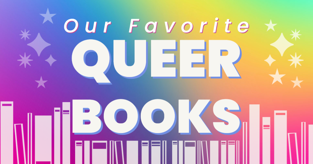
We love celebrating queer literature, so we’ve pulled together some of our favorites. If you haven’t checked these out, please, be our guest!
Red, White, and Royal Blue by Casey McQuiston
What happens when America's First Son falls in love with the Prince of Wales?
When his mother became President, Alex Claremont-Diaz was promptly cast as the American equivalent of a young royal. Handsome, charismatic, genius―his image is pure millennial-marketing gold for the White House. There's only one problem: Alex has a beef with the actual prince, Henry, across the pond. And when the tabloids get hold of a photo involving an Alex-Henry altercation, U.S./British relations take a turn for the worse. Heads of family, state, and other handlers devise a plan for damage control: staging a truce between the two rivals. What at first begins as a fake, Instragramable friendship grows deeper, and more dangerous, than either Alex or Henry could have imagined. Soon Alex finds himself hurtling into a secret romance with a surprisingly unstuffy Henry that could derail the campaign and upend two nations and begs the question: Can love save the world after all? Where do we find the courage, and the power, to be the people we are meant to be? And how can we learn to let our true colors shine through? Casey McQuiston's Red, White & Royal Blue proves: true love isn't always diplomatic. Storygraph review: kaebee_ “Loved, loved, absolutely loved this book. One of my all time favs this year by far. There were so many times where I just sat and laughed at something in this book and then moments where I held my breath and wished. Also definitely recommend listening to the audiobook and reading the book at the same time. Makes those funny moments even more funny.” The House in the Cerulean Sea by TJ Klune
Linus Baker is a by-the-book case worker in the Department in Charge of Magical Youth. He's tasked with determining whether six dangerous magical children are likely to bring about the end of the world.
Arthur Parnassus is the master of the orphanage. He would do anything to keep the children safe, even if it means the world will burn. And his secrets will come to light. An enchanting love story, masterfully told, The House in the Cerulean Sea is about the profound experience of discovering an unlikely family in an unexpected place—and realizing that family is yours. Storygraph review: audrey01 “There are two types of authors in this world: the ones that don’t impact you and the ones that do. TJ Klune is the latter. This book seems to have all the elements you would want: love, adventure, self-discovery and self-reflection all cooked up in a wonderful 398 pages. You’ll melt at Chauncey’s kindness, Lucy and Talia’s sass, Sal’s growth, Phee’s adventurous nature and Theodore’s quiet yet moving heart. But even more, you’ll find a love story that’s highlighted by the simple moments like a disagreement between two philosophers. A love story made real. Dear god I absolutely loved this story! I don’t want to spoil anything else but I will say two more things: special mention Calliope, Zoe and Helen (which btw I want more of!) and special mention to all these gorgeous gorgeous parts of the book (p 116, 119, 124, 158, 180, 182, 194, 208-209, 223, 231, 239, 247, 280, 283, 305, 307, 326, 333, 336, 338, 341, 360, 372, 376, 383, 396. A magical experience that I would recommend to anyone!” Kings, Queens, and In-Betweens by Tanya Boteju
Judy Blume meets RuPaul's Drag Race in this funny, feel-good debut novel about a queer teen who navigates questions of identity and self-acceptance while discovering the magical world of drag.
Perpetually awkward Nima Kumara-Clark is bored with her insular community of Bridgeton, in love with her straight girlfriend, and trying to move past her mother's unexpected departure. After a bewildering encounter at a local festival, Nima finds herself suddenly immersed in the drag scene on the other side of town. Macho drag kings, magical queens, new love interests, and surprising allies propel Nima both painfully and hilariously closer to a self she never knew she could be--one that can confidently express and accept love. But she'll have to learn to accept lost love to get there. From debut author Tanya Boteju comes a poignant, laugh-out-loud tale of acceptance, self-expression, and the colorful worlds that await when we're brave enough to look. Storygraph review: mstanley79 “This book felt like coming home. It felt like a hug. It felt safe in the best way possible. I wanted to disappear into it and soak up all the magic.” The Stonewall Reader by New York Public Library with Edmund White (Contributor)
June 28, 2019 marks the fiftieth anniversary of the Stonewall uprising, which is considered the most significant event in the gay liberation movement, and the catalyst for the modern fight for LGBTQ rights in the United States. Drawing from the New York Public Library's archives, The Stonewall Reader is a collection of first accounts, diaries, periodic literature, and articles from LGBTQ magazines and newspapers that documented both the years leading up to and the years following the riots. Most importantly the anthology spotlights both iconic activists who were pivotal in the movement, such as Sylvia Rivera, co-founder of Street Transvestites Action Revolutionaries (STAR), as well as forgotten figures like Ernestine Eckstein, one of the few out, African American, lesbian activists in the 1960s. The anthology focuses on the events of 1969, the five years before, and the five years after. Jason Baumann, the NYPL coordinator of humanities and LGBTQ collections, has edited and introduced the volume to coincide with the NYPL exhibition he has curated on the Stonewall uprising and gay liberation movement of 1969.
Storygraph review: wowshecanread “WOW I loved this book. Being able to read first-hand accounts of life as a queer person during the ‘60s from numerous points of view was absolutely illuminating in every sense of the word. For me, each story I read added another layer to the world I was able to visualize in my head, helping me imagine what felt like the real, immersive 3D world that these writers and activists once lived in.” The Seven Husbands of Evelyn Hugo by Taylor Jenkins Reid
Aging and reclusive Hollywood movie icon Evelyn Hugo is finally ready to tell the truth about her glamorous and scandalous life. But when she chooses unknown magazine reporter Monique Grant for the job, no one is more astounded than Monique herself. Why her? Why now?
Monique is not exactly on top of the world. Her husband has left her, and her professional life is going nowhere. Regardless of why Evelyn has selected her to write her biography, Monique is determined to use this opportunity to jumpstart her career. Summoned to Evelyn's luxurious apartment, Monique listens in fascination as the actress tells her story. From making her way to Los Angeles in the 1950s to her decision to leave show business in the '80s, and, of course, the seven husbands along the way, Evelyn unspools a tale of ruthless ambition, unexpected friendship, and a great forbidden love. Monique begins to feel a very real connection to the legendary star, but as Evelyn's story near its conclusion, it becomes clear that her life intersects with Monique's own in tragic and irreversible ways. The Seven Husbands of Evelyn Hugo is "Tinseltown drama at its finest" (Redbook): a mesmerizing journey through the splendor of old Hollywood into the harsh realities of the present day as two women struggle with what it means--and what it costs--to face the truth. Storygraph review: thebookishgamerr “Honest to God, this book... I can't put into words. Just... READ IT. LGBTQ+, bi-racial, all different types of races and people; so good and so beautifully handled.” Golden Girls Forever: An Unauthorized Look Behind the Lanai by Jim Colucci
The complete, first-ever Golden Girls retrospective, packed with hundreds of exclusive interviews, behind-the-scenes and never-before-revealed stories, more than two hundred color and black-and-white photos, commentary, and more.
They were four women of a certain age, living together under one roof in Miami--smart and strong Dorothy, airhead Rose, man-hungry belle Blanche, and smart-mouthed matriarch Sophia. They were the Golden Girls, and for seven seasons, this hilarious quartet enchanted millions of viewers with their witty banter, verve, sass, and love, and reaffirmed the power of friendship and family. Over thirty years after it first aired, The Golden Girls has become a cult classic, thanks to fan fiction, arts and crafts, podcasts, hundreds of fan blogs and websites, and syndication. Now, Golden Girls Forever pays homage to this wildly popular, acclaimed, and award-winning sitcom. Drawing on interviews with the show's creators, actors, guest stars, producers, writers, and crew members, Jim Colucci paints a comprehensive portrait of the Girls both in front of the cameras and behind the scenes. Bursting with fun facts, anecdotes, reminiscences, and insights, Golden Girls Forever is the ultimate companion to the show for fans old and new. Storygraph review: nicolemhill “This is the greatest book I have ever read. I am not exaggerating. This is the ur-text for the rest of my life.” All Boys Aren’t Blue by George M. Johnson
In a series of personal essays, prominent journalist and LGBTQIA+ activist George M. Johnson explores their childhood, adolescence, and college years in New Jersey and Virginia. From the memories of getting their teeth kicked out by bullies at age five, to flea marketing with their loving grandmother, to their first sexual relationships, this young-adult memoir weaves together the trials and triumphs faced by Black queer boys.
Both a primer for teens eager to be allies as well as a reassuring testimony for young queer men of color, All Boys Aren't Blue covers topics such as gender identity, toxic masculinity, brotherhood, family, structural marginalization, consent, and Black joy. Johnson's emotionally frank style of writing will appeal directly to young adults. Storygraph review: redlikeroses “I usually don't pick up memoirs-it's just not my thing. I usually don't like them. All Boys Aren't Blue however, is an exception. “As a bisexual, I always have had a craving since childhood to see myself in other people. My struggles, my heartbreak, my fear and my love. This book did that. I truly could relate to all the trauma and hope that George Johnson has gone through, though we may have been from different backgrounds. “Reading this was like reading a part of my soul, a part that has been tucked away for so long I started to doubt, even wish it didn't exist. After all, who wants to be afraid for their lives for being different? Johnson ends it by saying "Whether this book is a bestseller or a flop, if one person is helped by my story, then it was all worth it." (297) “It was worth it. Thank you Mr. Johnson.” The Starless Sea by Erin Morgenstern
Zachary Ezra Rawlins is a graduate student in Vermont when he discovers a mysterious book hidden in the stacks. As he turns the pages, entranced by tales of lovelorn prisoners, key collectors, and nameless acolytes, he reads something strange: a story from his own childhood.
Bewildered by this inexplicable book and desperate to make sense of how his own life came to be recorded, Zachary uncovers a series of clues--a bee, a key, and a sword--that lead him to a masquerade party in New York, to a secret club, and through a doorway to an ancient library, hidden far below the surface of the earth. What Zachary finds in this curious place is more than just a buried home for books and their guardians--it is a place of lost cities and seas, lovers who pass notes under doors and across time, and of stories whispered by the dead. Zachary learns of those who have sacrificed much to protect this realm, relinquishing their sight and their tongues to preserve this archive, and also those who are intent on its destruction. Together with Mirabel, a fierce, pink-haired protector of the place, and Dorian, a handsome, barefoot man with shifting alliances, Zachary travels the twisting tunnels, darkened stairwells, crowded ballrooms, and sweetly-soaked shores of this magical world, discovering his purpose--in both the mysterious book and in his own life. Storygraph review: amhud1030 “This is a favorite for me, and this is a reread however my first time listening to the audio. Which I highly recommend as the narration is excellent! “I find it difficult to describe this book All I can say is every time I read it, it consumes me and I can’t read anything else. I must give this book my full attention. “It seems per other reviewers that this tends to be a love it or hate it book for many. For me it is a love, one of my favorites. “This book is stories within, stories that are non linear however the characters and stories are all woven together. “It is so visually descriptive you feel like you are in these places, and can see, touch, smell and taste what’s being described.” Wilder Girls by Rory Power
It's been eighteen months since the Raxter School for Girls was put under quarantine. Since the Tox hit and pulled Hetty's life out from under her.
It started slow. First the teachers died one by one. Then it began to infect the students, turning their bodies strange and foreign. Now, cut off from the rest of the world and left to fend for themselves on their island home, the girls don't dare wander outside the school's fence, where the Tox has made the woods wild and dangerous. They wait for the cure they were promised as the Tox seeps into everything. But when Byatt goes missing, Hetty will do anything to find her, even if it means breaking quarantine and braving the horrors that lie beyond the fence. And when she does, Hetty learns that there's more to their story, to their life at Raxter, than she could have ever thought true. Storygraph review: swamp_wytch “This book was so good. The pacing was great, and the core story is haunting. I wish it hadn't ended so abruptly, but it feels like it's setting up for a sequel, and if that's the case I'll buy it ASAP” Sistersong by Lucy Holland
King Cador’s children inherit a land abandoned by the Romans, torn by warring tribes. Riva can cure others, but can’t heal her own scars. Keyne battles to be seen as the king’s son, although born a daughter. And Sinne dreams of love, longing for adventure.
All three fear a life of confinement within the walls of the hold, their people’s last bastion of strength against the invading Saxons. However, change comes on the day ash falls from the sky – bringing Myrdhin, meddler and magician. The siblings discover the power that lies within them and the land. But fate also brings Tristan, a warrior whose secrets will tear them apart. Riva, Keyne and Sinne become entangled in a web of treachery and heartbreak, and must fight to forge their own paths. It’s a story that will shape the destiny of Britain. Storygraph review: irfoxwriter “An absolutely brilliant book! I adored the characters and found myself very emotionally attached to all three main protagonists, despite sometimes disagreeing with their choices. I loved that it is written in first person present - unusual but so compelling and allows you to feel very close to the characters.” Loveless by Alice Oseman
Georgia has never been in love, never kissed anyone, never even had a crush – but as a fanfic-obsessed romantic she’s sure she’ll find her person one day. As she starts university with her best friends, Pip and Jason, Georgia’s ready to find romance, and with her outgoing roommate on her side and a place in the Shakespeare Society, her ‘teenage dream’ is in sight.
But when her romance plan wreaks havoc amongst her friends, Georgia ends up in her own comedy of errors, and she starts to question why love seems so easy for other people but not for her. With new terms thrown at her — asexual, aromantic — Georgia is more uncertain about her feelings than ever. Is she destined to remain loveless? Or has she been looking for the wrong thing all along? Storygraph review: geodrite “growing up as a hopeless romantic aroace without realizing i was aroace was terrifying because i always felt like i was broken in some way when other people described their experiences with sexuality and romantic attraction, but the older i get the more i realize just how many of us aroaces are out there. it's so liberating to finally see the representation and recognition that i needed and i hope that no one ever has to feel like they're alone again.” Iron Widow by Xiran Jay Zhao
The boys of Huaxia dream of pairing up with girls to pilot Chrysalises, giant transforming robots that can battle the mecha aliens that lurk beyond the Great Wall. It doesn’t matter that the girls often die from the mental strain.
When 18-year-old Zetian offers herself up as a concubine-pilot, it’s to assassinate the ace male pilot responsible for her sister’s death. But she gets her vengeance in a way nobody expected—she kills him through the psychic link between pilots and emerges from the cockpit unscathed. She is labeled an Iron Widow, a much-feared and much-silenced kind of female pilot who can sacrifice boys to power up Chrysalises instead. To tame her unnerving yet invaluable mental strength, she is paired up with Li Shimin, the strongest and most controversial male pilot in Huaxia. But now that Zetian has had a taste of power, she will not cower so easily. She will miss no opportunity to leverage their combined might and infamy to survive attempt after attempt on her life, until she can figure out exactly why the pilot system works in its misogynist way—and stop more girls from being sacrificed. Storygraph review: cristina_m_casas “I will always root for feminine rage so Zetian was someone who was easy to get behind. I really appreciated how her initial mission was over so quickly & so much of the book was her constantly pivoting & honestly going a little power mad. “The relationship development was so amusing to me because as a reader it was fairly obvious where it was heading but the characters are so oblivious. “I couldn’t answer a single question you asked me about the chrysalises or the war; but the vibes were excellent!! I look forward to the sequel & the author’s inevitable book about the French Revolution. “This book majorly gave the hunger games for me despite them being so different” This Is How You Lose the Time War by Max Gladstone, Amal El-Mohtar
From award-winning authors Amal El-Mohtar and Max Gladstone comes an enthralling, romantic novel spanning time and space about two time-traveling rivals who fall in love and must change the past to ensure their future.
Thus begins an unlikely correspondence between two rival agents hellbent on securing the best possible future for their warring factions. Now, what began as a taunt, a battlefield boast, becomes something more. Something epic. Something romantic. Something that could change the past and the future. Except the discovery of their bond would mean the death of each of them. There’s still a war going on, after all. And someone has to win. That’s how war works, right? Cowritten by two beloved and award-winning sci-fi writers, This Is How You Lose the Time War is an epic love story spanning time and space. Storygraph review: vicsbookishthings “This book has my soul in the palm of its hand. The prose, the beautiful descriptions of love, the nicknames, the banter are *chef’s kiss* the best things I’ve ever read.” Nimona by ND Stevenson
Nemeses! Dragons! Science! Symbolism! All these and more await in this brilliantly subversive, sharply irreverent epic from ND Stevenson. Featuring an exclusive epilogue not seen in the web comic, along with bonus conceptual sketches and revised pages throughout, this gorgeous full-color graphic novel has been hailed by critics and fans alike as the arrival of a "superstar" talent.
Nimona is an impulsive young shapeshifter with a knack for villainy. Lord Ballister Blackheart is a villain with a vendetta. As sidekick and supervillain, Nimona and Lord Blackheart are about to wreak some serious havoc. Their mission: prove to the kingdom that Sir Ambrosius Goldenloin and his buddies at the Institution of Law Enforcement and Heroics aren't the heroes everyone thinks they are. But as small acts of mischief escalate into a vicious battle, Lord Blackheart realizes that Nimona's powers are as murky and mysterious as her past. And her unpredictable wild side might be more dangerous than he is willing to admit. Storygraph review: kaseycanread “I loved every second of this” The Midnight Girls by Alicia JasinskaIn a snow-cloaked kingdom, two wicked rivals secretly compete for the pure heart of a prince, only to discover they might be falling for each other. Karnawał season is a time for mischief and revelry. For the next few weeks, all will be wintry balls, glittery disguises, and nightly torch-lit sleigh-parties. Unbeknownst to the merrymakers, two uninvited girls join the fun. Zosia and Marynka are drawn to each other the moment they meet, until they discover they're rivals, who both have their sights set on the prince's heart. If one consumes a pure heart, she'll gain immeasurable power. Marynka plans to bring the prince's back to her patron in order to prove herself. While Zosia is determined to take his heart and its power for her own. Their ambition turns into a magical contest with both girls vying to keep the prince out of the other's grasp, even as their attraction to one another grows. But their attempts on his life draws the attention of the city that would die for him, and suddenly their escalating rivalry might cost them not just their love for each other, but both their lives. Storygraph review: chuuzone “oh this had EVERYTHING i wanted... ya sapphic fantasy with the two mcs being the "i fucking hate you pls just drop dead so i can win this round you infuriate me so bad oh my god i wanna kiss you so hard" kind of rivals who get such a thrill from fighting and competing with each other that the sexual tension is coming off from the pages in waves and you're waiting for them to kiss in the middle of the battle, the gay ass prince x knight side characters who also hate each other but not really because they have underlying affections for one another, all the banter between the mcs mid-fight, and the banter between one of the mcs and the prince who she's supposed to kill, THE "DON'T TOUCH HER!" TROPE BUT SAPPHIC, the kiss scene, everyone is gay I NEED MORE” written by Grace Ball
0 Comments
You’ve likely heard about the divisiveness of the font Comic Sans. The font is not inherently bad; in fact, it’s friendly and inviting. However, the font is widely regarded as a joke, and yet it remains available to users of many word processors more than 25 years after its invention. How did Comic Sans come to be? How did it turn into such a joke? And why is it still available for anyone to use?
The invention of Comic Sans
Let’s go back in time a bit to the early days of the internet. In the mid-1990s, Microsoft was only just starting to place personal computers in people’s homes. These days, a three-year-old can pick up any smart phone and perform a number of tasks. Back in the 90s, most professionals did not know how to use a computer.
To teach private users how to interact with a computer interface, Microsoft developed Microsoft Bob. Microsoft Bob was a program that visually resembled a standard upper-middle-class home office. The idea was that connecting computer functions to the image of an office would help people to conceptualize what their computer was capable of. Characters in Microsoft Bob communicated with the user through speech bubbles, and that speech was originally set in Times New Roman. 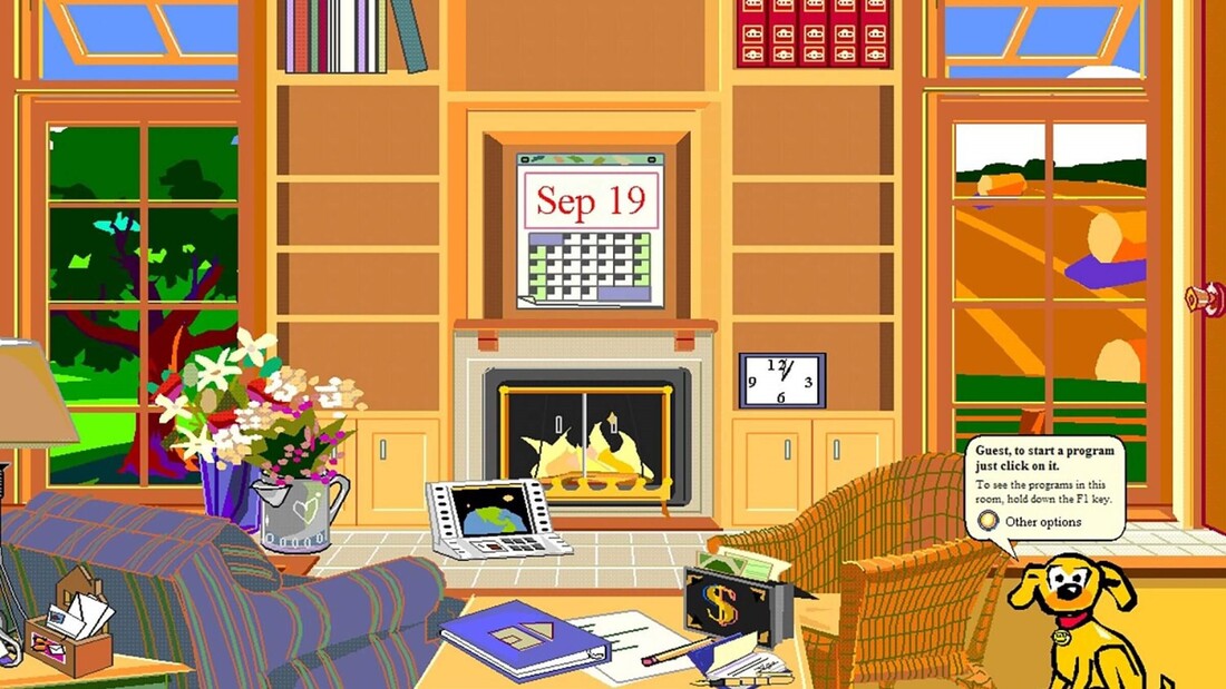
Microsoft Bob
The problem was that Microsoft Bob . . . sucked. It was clunky and unhelpful. Even Melinda Gates has referred to it as a failure.
What does this have to do with Comic Sans? Comic Sans was developed by Vincent Connare specifically for use in Microsoft Bob. He felt that Times New Roman was too stiff and formal for what was supposed to be a learning program. It was meant to emulate chunky, childish comic book fonts, and its purpose was to set first-time computer users at ease. The problem was that Comic Sans was not complete before the first iteration of Microsoft Bob rolled out, Microsoft Bob was a failure that did not last long, and Comic Sans probably should have been thrown directly in the garbage at this point. But it wasn’t. Beyond Microsoft Bob
Connare said in an interview with Ilene Strizver of fonts.com, “When I designed Comic Sans, there was no expectation of including the font in applications other than those intended for children.” Microsoft first used Comic Sans in text bubbles in Microsoft 3D Movie Maker, which was indeed designed for children. Eventually, however, Comic Sans was added to the 1995 Windows as a system font option.
Soon, graphic designers and computer users alike quickly grew tired of seeing Comic Sans everywhere, particularly in serious correspondence, where the silly font was inappropriate. In 1999, two graphic designers launched a website called Ban Comic Sans in response to being pressed to use Comic Sans for a museum exhibit design. As the internet was popularized and meme culture grew, the joke of Comic Sans grew with it. One of the most popular Comic Sans memes is the original doge meme, a series of images of grinning Husky dogs captioned with silly messages written using questionable grammar and spelling—and using Comic Sans. In 2011, Microsoft released Comic Sans Pro, which included features like italics, small caps, and more. This was released on April Fools’ Day, furthering the narrative that Comic Sans is a joke. What are fonts for?
Fonts carry vibes; there’s no getting around that. Even the most common, neutral fonts, like Times New Roman or Arial, say that the writer is straightforward, professional, and/or no-nonsense. Using audacious fonts like Chiller or Blackadder for anything real, anything substantial, says the writer is immature and not taking their project seriously. That’s the reality of fonts.
Microsoft Word can carry hundreds of different fonts, but most of the time, a regular user simply doesn’t need these. The many thousands of fonts that exist on the internet are for graphic designers to choose with much discerning. Regular people may not know what fonts look ridiculous in what circumstances, but a designer is trained to use different fonts to carefully curate a book’s (or graphic’s) aesthetic. The problem with Comic Sans is not that it exists. Wingdingz exists for some reason, so there are more baffling fonts out there. The problem with the font is that it seems like many people have no idea what kind of impression it sends, and they use it so liberally. The average internet user will see Comic Sans so much more frequently than Chiller or Blackadder. The font is specifically designed to be animated, juvenile, and silly. It kind of replicates a child’s handwriting, if they were particularly uniform and neat. Yet there are many people out there who use Comic Sans in baffling situations, like when sending an office memo or creating a resume. Comic Sans is sort of the polar opposite of professionalism, representing immaturity, movement, and failure. When scientists at CERN discovered the Higgs Boson, Fabiola Gianotti presented her results using Comic Sans. A Dutch World War II memorial was unveiled in 2012 featuring the names of Jewish, Allied, and German military deaths, all written in Comic Sans. During the UK’s great Brexit debate, the conservative party tweeted a message encouraging the parties to come together, which had been styled in Comic Sans. These are some great examples of times in which Comic Sans should not have even been considered for one moment, as its use greatly diminished the weight of what was being said. Why this is important for authors
Especially for authors who are just getting their writing careers started, nothing is more important than being professional. Publishers, editors, and even readers want to be assured that you know what you’re doing, that you’re professional, that you take your work seriously.
Particularly because typography is such an integral part of publishing a book, it’s even more important for an author to demonstrate that they have an understanding of parts of a book, including typefaces. The use of Comic Sans says, “Don’t take me seriously, and my book won’t be serious either.” What's Comic Sans good for, then?
Comic Sans is good for casual communication that is not serious, not professional, and not important. If you’re in a situation where font just straight-up does not matter, fine. Use Comic Sans. But be aware that you may be judged for it nonetheless.
There is also anecdotal evidence that Comic Sans is easier than other fonts for dyslexic people to read, though there have been no studies to support this with concrete data. However, it’s common for readers with dyslexia to prefer sans serif fonts, and the weighted sides of Comic Sans may indeed make text easier to read. There is also anecdotal evidence that Comic Sans helps writers to get rid of writer’s block, as the casual and even silly appearance of the font takes some pressure off that a writer may be feeling when writing in Times New Roman, the preferred font of publishers. This is not to say that Comic Sans is good for nothing. We are just here to beg people to stop using the font seriously, professionally, and opt for sharper options. If you’re not keen on the standard Times New Roman or Arial, try a similar variant like Garamond or Calibri. We’re happy to advise!
Sources:
https://uxdesign.cc/the-ugly-history-of-comic-sans-bd5d07f8ce81 https://www.fonts.com/content/learning/fyti/typefaces/story-of-comic-sans https://www.howtogeek.com/707340/the-origin-of-comic-sans-why-do-so-many-people-hate-it/ written by Christina Kann 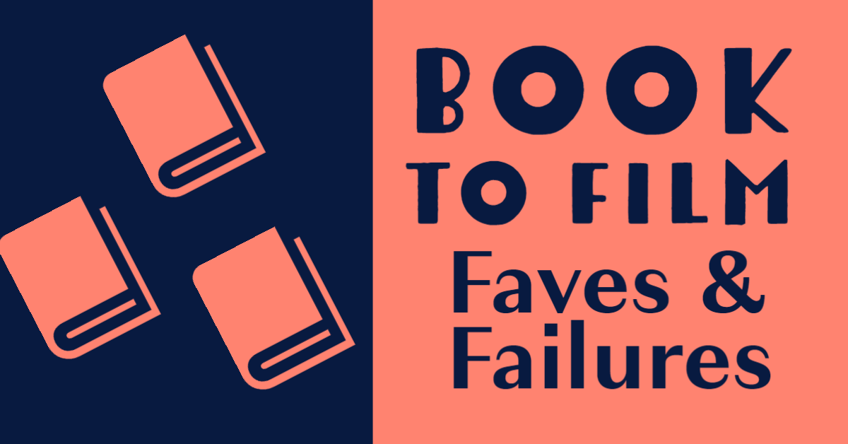
Some people say that when you read a book, you create a movie in your head, so there’s simply no need for the existence of book-to-film adaptations. However true that may be, those adaptations do exist, and some are excellent and others are absolute travesties. Here at Wildling, we have strong opinions on this topic, and we’re sharing them with you!
Christina's fave: His Dark Materials (2019-current)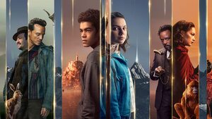
This is a TV show on Amazon, not a film, but same diff! This series based on the Philip Pullman trilogy is a beautiful, skillful tribute to the original text. The book series is complex, fantastical, and multifaceted, and the show manages to convey all of the many layers of this story without seeming to have to compress anything together or skip anything—seriously, I was hard-pressed to find a single omission that I didn’t fully agree with. In fact, they even found the time to develop some characters and plotlines more thoroughly than the books did. This show is the perfect argument for my thesis that fantasy book series are truly better served by being developed into shows rather than films. Seasons 1 and 2 (based on books 1 and 2) are out on Amazon now, with Season 3 due in 2022.
Christina's failure: Dune (1984)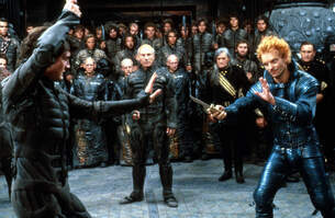
This film is an insult to the original text, its beautiful and cerebral themes, and its vast, fiercely devoted fan base. The film was too long by about two hours, and yet somehow it failed to explain properly even the most foundational concepts from the novel. Granted, the novel is dense, vast, and epic—but the movie seemed to have truly turned its nose up at the source material the way a child quits the school band when they can’t master the trumpet within a week. The ubiquitous touch of the mid-eighties didn’t help things, either. DO NOT WATCH.
The new movie is great, though. Christina's bonus: Ella Enchanted (2004)
There are a couple of films out there that are terrible adaptations of their source material, but really fun in their own right. My numero uno in this category is Ella Enchanted. The book is great. The film is great. They have next to no resemblance to each other beyond some core concepts, like the main character having to obey any command and eventually falling in love (sorry, spoilers!). My brain can separate these enough to appreciate each of them without comparing them.
Mary-Peyton's fave: Anne of Green Gables (1985)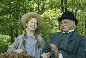
I could watch the 1985 film adaptation of this book over and over again! It really captured the heart of the book, and Megan Follows perfectly captured the wild spirit of Anne Shirley--a kind, clumsy, and stubborn girl adopted by an older couple who had wanted to adopt a boy, but ended up falling in love with the quirky redheaded bookworm. I wish every little girl could watch this movie, like I did (well, maybe not exactly like I did, since I had it on two VHS tapes). Anne didn’t fit into the small, quiet box that young ladies were meant to inhabit in her world (and still are in this world), and although people tried to shame her, she never apologized for being herself. The acting in this film was perfect, subtle, and real, and the writing kept much of the humor and heart that makes the book so wonderful. I highly recommend this for a family movie night.
Mary-Peyton's failure: The Lion, the Witch, and the Wardrobe (2005)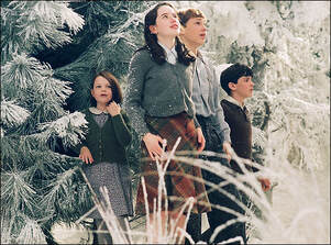
When I read these books as a kid, I was enchanted. The real world would melt away, and I’d find myself completely within the world of Narnia alongside Lucy, Edmund, Susan, Peter, and Aslan. So years later, when I first saw the movie trailer, I was beyond excited. But I was so disappointed in the movie. As often happens when grown-ups decide to make a popular children’s book into a movie, it had lost much of what made the story wonderful; ironically, it had lost much of its wisdom and depth. The best kids books, the classics that stay with us throughout time, deal with some really heavy and “grown-up” topics, like grief, betrayal, and loneliness, in such a way that helps kids process those things. But the movie version of such books often comes out as a shallow, cartoonish, and flashy shell of the book. Ella Enchanted, The Golden Compass, and the Percy Jackson series are great examples of this--those books are downright dark and even scary at parts, which makes the story so much more intense; the more terrible the evil, the more magical it is when good wins. Kids don’t fall in love with these magical adventures because they’re fun; they love them because they are full, deep, and emotional stories of bravery, growth, kindness, and more. The fantastical adventure is only part of the appeal. It seems like the people who made these movies missed the point.
Michael's fave: The Princess Bride (1987)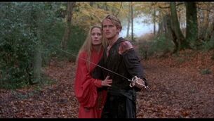
Who doesn’t love The Princess Bride film adaptation? If you don’t, I don’t want to know you. Too harsh? Maybe, but this movie is amazing! It has it all: adventure, comedy, suspense, and wuv, tru wuv. William Goldman, the author, was a huge part of the adaptation and this helped keep the movie true to the book. And with Rob Reiner directing, pure magic was made. He also directed book to movie adaptations like Stand by Me and Misery. The only bits and pieces of the book that are not found in the film were edited out simply because of time constraints. And anything added were small additions; did you know there weren’t any shrieking eels in the book? As someone who deliberately reads the book before the movie comes out so they can tell whoever will listen how much the movie failed to capture the power of the book, I’m happy to report that this is one adaptation I can do nothing but praise.
Michael's failure: Miss Peregrine's Home for Peculiar Children (2016)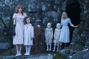
I had such high hopes for this film adaptation, especially with Tim Burton at the helm! I just knew he would be able to capture the right amount of darkness that hangs over the Peregrine universe. But . . . the movie was an utter disappointment. The author, Ransom Riggs, should have had more of an opinion during filming. Tim Burton ended up swapping the main female character’s powers for those of a weaker female character, which felt like it was just so the main male character could be more of a hero. Then, because Tim Burton wanted to work with Samuel L. Jackson so badly, he created a character and story line that isn’t found in the book. It completely changed the vibe of the first book, and the direct consequence was they couldn’t make a movie series using the other books. Maybe that was a blessing because this film was a complete letdown.
Grace's fave: Practical Magic (1998)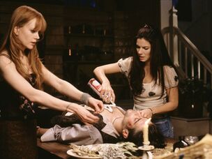
I probably watched this movie for the first time during my preteen years, so it has a special place in my heart. When I found out it was based on a book by none other than the amazing Alice Hoffman, I had to read it. Even though I really enjoyed this book, I truly think the movie is a culmination of the book’s strongest parts—and that’s not just because of the “special place in my heart” thing I mentioned. Okay, maybe a little. There are plenty of differences between the book and movie versions, and they’re both fabulous in their own ways, but I think the Practical Magic movie is an awesome example of how a film adaptation doesn’t have to be a scene-for-scene remake of the book to be good.
Grace's failure: Percy Jackson and the Olympians: The Lightning Thief (2010)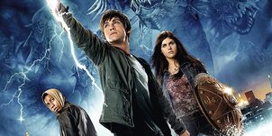
This movie adaptation is so bad that I haven’t even seen it!! I’ve heard enough to know I need to stay away, far away. I know, I probably should’ve included a movie adaptation I’ve actually seen, but the validity of our list would’ve been called into question without, so did I really have a choice? I somehow missed the Percy Jackson train when it rolled through years ago, so I’m catching up and reading them now. I’m smack-dab in the middle—ugh, maybe I’ll end up watching the movie one day. I’ll let you know if I do!
Feel free to add to our list with your favorite and least favorite book-to-film adaptations in the comments below! by Grace Ball |
How Do I Book?We'll try to find the answer to that question in our blog. Archives
August 2023
Categories
All
|
 RSS Feed